Add Row
Add Element
cropper
update
update
Add Element
  • Home
  • Categories
    • Operational Excellence
    • Compliance Corner
    • Performance Metrics
    • Growth Strategies
    • Brand Consistency
    • Technology Trends
    • Franchisee Success
March 28.2025
2 Minutes Read

Korean Air's New Look: Key Branding Lessons for Franchisors

Korean Air rebranding event for franchisors, airplane display.

Korean Air’s Bold New Identity: What It Means for the Franchise Sector

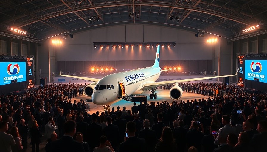
As Korean Air unveils its refreshed brand identity, marked by a sleek design overhaul and a modern take on its iconic Taegeuk symbol, franchisors can glean valuable insights into the importance of branding consistency and adaptability in a global marketplace. After more than four decades without significant visual change, the recent transformation is not just cosmetic – it symbolizes the airline's commitment to innovation and customer engagement, a principle that franchisors can implement to enhance their operational efficiency and brand consistency.

Why Branding Matters: Lessons from Korean Air

The refreshed brand identity is a crucial reminder that branding is more than just logos and colors. For Korean Air, the incorporation of a contemporary metallic sky-blue fuselage paired with a streamlined corporate typeface encapsulates a dual narrative: respect for tradition while embracing future-forward thinking. For franchises, maintaining a cohesive brand identity across multiple locations builds trust with consumers and reinforces the values and quality standards of the franchise.

Visual Elements that Attract Attention

With the shift to a polished, metallic-effect color scheme, Korean Air exemplifies how visual elements can capture consumer attention. The airline has carefully redesigned its aircraft livery and marketing materials, featuring modern patterns that pay homage to Korean culture. Franchises can apply this strategy by ensuring that their branding elements reflect a contemporary feel while echoing their own history and values, thereby making their brand relatable through compelling visuals.

Aligning Brand Messaging Across Customer Touchpoints

Korean Air’s use of a three-dimensional motif derived from its newly simplified Taegeuk design is a brilliant example of brand consistency across various customer touchpoints. From mobile apps to check-in screens, every interaction reflects the brand’s ethos. Franchise operators should strive to integrate their branding throughout customer interactions, ensuring that every touchpoint — whether online or offline — presents a unified and recognizable face to the consumer.

Framework for Future Success in Brand Management

This rebranding initiative offers valuable lessons in the need for regular updates and relevance in brand management. As consumer expectations evolve, it’s essential for franchises to revisit and refresh their branding to stay appealing. This could mean updating visuals, reassessing brand messaging, or even revitalizing customer service practices to align with contemporary market trends.

Overall, Korean Air’s new identity not only focuses on aesthetics but strategically aligns brand values with customer experiences. As franchisors seek growth and aim to enhance franchisee performance, these insights can drive operational excellence and ensure consistent delivery of brand promises across all locations. Are you ready to take a cue from Korean Air and elevate your franchise’s brand identity?

Brand Consistency

12 Views

0 Comments

Write A Comment

*
*
Related Posts All Posts
10.05.2025

Understanding Closed Ecosystems: Are They a Necessary Evil for Brands?

Explore how closed ecosystems like Apple’s impact user choice, innovation, and brand strategies for franchisors.

10.04.2025

Why Double-Clicking Is Dead: Embracing Modern UX Innovations

Update Embracing Change: The End of Double-Clicking in Modern UXThe digital landscape is rapidly changing, mirroring the evolution of user expectations. From clunky interfaces to sleek, intuitive designs, the way we interact with software has transformed tremendously. This change is underscored by the demise of the double-click, an antiquated relic from the desktop era that fails to meet the demands of contemporary user experience (UX).The Clumsy Evolution of Double-ClickingHistorically, the double-click emerged as a solution to a limited input system during the early days of graphical user interfaces. Back then, it was a clever workaround—allowing users to differentiate between selecting an item and activating it. However, as our interaction environments have evolved, the question arises: why does double-clicking still exist in some corners of the tech world today?Legacy Behaviors Cause User FrustrationThe answer lies in inertia. OS designers and software engineers have stuck to this dated interaction model simply because it has always been that way. The usability struggles of double-clicking often lead to user frustration, especially among older individuals or those with dexterity challenges, contributing to a lack of accessibility that many are unaware of.Mobile’s Influence: The Push for SimplicityMoreover, mobile devices have become the new UX boot camps. On smartphones, every tap counts; there is no room for the redundancy that a double-click brings. Instead, designers have favored simplicity—taps, swipes, and voice commands are the new norms. Why? Because users require immediate, efficient interactions free from confusion. Complaints from users stuck in the double-clicking mentality only highlight a fundamental mismatch between user expectations and tech’s delivery.The Case Against Double-ClickingArguments in favor of double-clicking often cite speed. However, speed is irrelevant if the gesture is inconsistent. Variations in user settings, speed differences among individuals, and the high chance of misfires reveal double-clicking to be much more of a hindrance than a help. Advocating for more universal designs focuses on making interactions as smooth and inclusive as possible.Web UX: Moving Beyond Double-ClickFortunately, the web design community has already pushed past double-click interactions. Modern web applications have streamlined designs that prioritize clarity, minimizing unnecessary interaction steps. Contextual UIs that dynamically adapt to user intent are the new frontier, transforming user experiences and eliminating outdated habits.Future Predictions: AI and Gesture-Based InterfacesAs we look to the future, it's evident that gesture-based interfaces, coupled with AI-driven predictive functionalities, are on the rise. These technologies will enhance how we navigate digital landscapes, making inefficient elements like double-clicking completely obsolete. It’s about creating an interface durable enough to engage without requiring users to re-learn outdated frameworks.A Call to Reinvent User Engagement For franchisors and brands looking to optimize operational efficiency, it’s crucial to recognize these shifts in UX. Let’s start embracing a climate where ease of use reigns and outdated designs are replaced with smarter, more engaging interactions. Today’s users want interfaces that respect their time and intelligence, cultivating brand loyalty in an increasingly competitive market.As digital designers and marketers, the challenge lies in identifying and dismantling these obsolete paradigms to favor designs that enhance user interactions. By championing contemporary UX solutions, we can foster deep connections between brands and users, enriching experiences that lead to better outcomes for everyone involved.

10.03.2025

Unlocking Neurobranding: Emotion-Driven Strategies for Franchisors

Discover how neurobranding strategies can transform franchisor marketing by leveraging emotional triggers and sensory engagement to foster deep customer loyalty and enhance brand consistency.

Terms of Service

Privacy Policy

Core Modal Title

Sorry, no results found

You Might Find These Articles Interesting

T
Please Check Your Email
We Will Be Following Up Shortly
*
*
*