Add Row
Add Element
cropper
update
update
Add Element
  • Home
  • Categories
    • Operational Excellence
    • Compliance Corner
    • Performance Metrics
    • Growth Strategies
    • Brand Consistency
    • Technology Trends
    • Franchisee Success
March 15.2025
3 Minutes Read

Why Two Search Bars on Unsplash Complicate User Experience

Why Two Search Bars on Unsplash Complicate User Experience


Why Simplicity Is Key in Modern Web Design

When you think about navigating a website, clarity and ease of use are essential. One of the most fundamental principles of great web design is simplicity. A well-designed site should guide the user effortlessly to their goal, not overwhelm them with choices. Unsplash, a favorite among creatives for its beautiful images, is currently caught in a maze of its own making. The decision to implement two search bars has created a cluttered user experience, diverting attention from what truly matters: accessing its stunning library of free stock images.

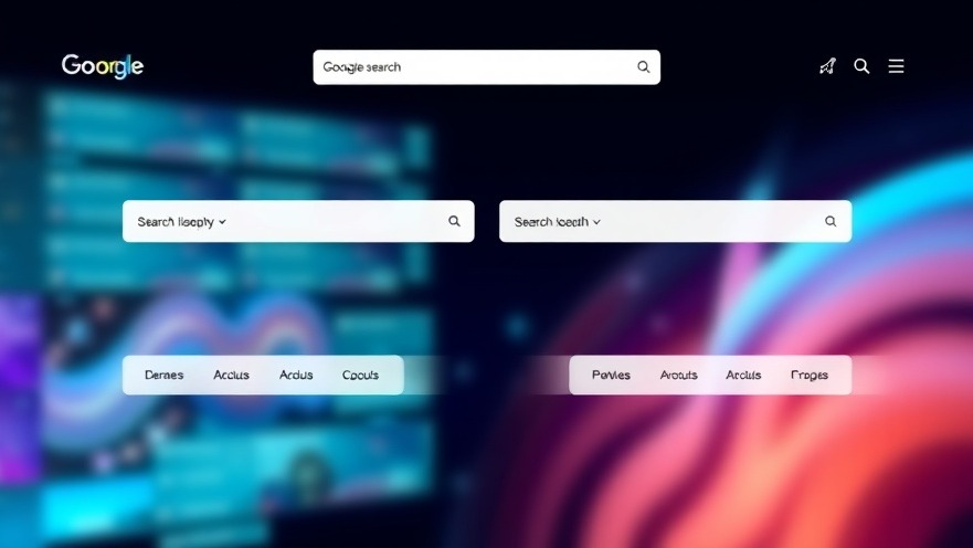
Two Search Bars: A Confusing Dilemma

The dilemma revolves around Unsplash's homepage, where landing on a cluttered interface featuring two nearly identical search bars can feel like running a gauntlet. Users quickly question the necessity of having two search options that lead to identical results. Rather than enhancing the navigation experience, this redundancy creates unnecessary complexity. For first-time visitors, especially those unfamiliar with the platform, this can be incredibly frustrating, muddying their initial impression of the site.

Redundancy vs. Efficiency: The Balance of Options

There's no doubt that providing options is crucial in creating user-centric designs. However, opportunities should not morph into confusion. The moment users arrive at a homepage cluttered with excessive options, it jeopardizes the ease of finding the information they need. In this case, Unsplash risks alienating even the most dedicated of users with an imprecise layout. The balance lies in prioritizing options that enhance clarity rather than adding to navigation woes.

The Expert Viewpoint: Insights from Designers

In the field of web design, experts emphasize the importance of fast user decision-making. Research indicates that users form opinions about a site's quality within seconds of arrival, often judging its navigation as one of the first elements. With this in mind, how does Unsplash’s approach align with these principles? Instead of empowering users, the presence of two search bars sends mixed signals about the site's usability. Designers must understand that less is often more, prioritizing simplicity to benefit the overall user experience.

What Can Be Done?

The potential solutions for Unsplash are straightforward. Streamlining the interface by consolidating search functionality into a single, powerful search advantage would not only declutter the homepage but also enhance user satisfaction. By ensuring that the search bar is both efficient and unique in its capability, Unsplash can redirect focus where it matters most. Integrating the idea of specificity in one search, while maintaining flexibility in a thoughtfully designed interface, may well be the answer to their navigation conundrum.

Final Thoughts: A Call to Action for Unsplash and Beyond

The ongoing design discussion around Unsplash highlights an important lesson for all web developers: never underestimate the impact of a streamlined design. In a realm where clarity leads to higher user satisfaction, the need for excessive features can lead to a decline in engagement. As a parting note, creators across the digital landscape are encouraged to evaluate their own designs critically. Let’s aim for elegant simplicity, embrace clarity, and filter out the noise that complicates user journeys.


Brand Consistency

7 Views

0 Comments

Write A Comment

*
*
Related Posts All Posts
10.05.2025

Understanding Closed Ecosystems: Are They a Necessary Evil for Brands?

Explore how closed ecosystems like Apple’s impact user choice, innovation, and brand strategies for franchisors.

10.04.2025

Why Double-Clicking Is Dead: Embracing Modern UX Innovations

Update Embracing Change: The End of Double-Clicking in Modern UXThe digital landscape is rapidly changing, mirroring the evolution of user expectations. From clunky interfaces to sleek, intuitive designs, the way we interact with software has transformed tremendously. This change is underscored by the demise of the double-click, an antiquated relic from the desktop era that fails to meet the demands of contemporary user experience (UX).The Clumsy Evolution of Double-ClickingHistorically, the double-click emerged as a solution to a limited input system during the early days of graphical user interfaces. Back then, it was a clever workaround—allowing users to differentiate between selecting an item and activating it. However, as our interaction environments have evolved, the question arises: why does double-clicking still exist in some corners of the tech world today?Legacy Behaviors Cause User FrustrationThe answer lies in inertia. OS designers and software engineers have stuck to this dated interaction model simply because it has always been that way. The usability struggles of double-clicking often lead to user frustration, especially among older individuals or those with dexterity challenges, contributing to a lack of accessibility that many are unaware of.Mobile’s Influence: The Push for SimplicityMoreover, mobile devices have become the new UX boot camps. On smartphones, every tap counts; there is no room for the redundancy that a double-click brings. Instead, designers have favored simplicity—taps, swipes, and voice commands are the new norms. Why? Because users require immediate, efficient interactions free from confusion. Complaints from users stuck in the double-clicking mentality only highlight a fundamental mismatch between user expectations and tech’s delivery.The Case Against Double-ClickingArguments in favor of double-clicking often cite speed. However, speed is irrelevant if the gesture is inconsistent. Variations in user settings, speed differences among individuals, and the high chance of misfires reveal double-clicking to be much more of a hindrance than a help. Advocating for more universal designs focuses on making interactions as smooth and inclusive as possible.Web UX: Moving Beyond Double-ClickFortunately, the web design community has already pushed past double-click interactions. Modern web applications have streamlined designs that prioritize clarity, minimizing unnecessary interaction steps. Contextual UIs that dynamically adapt to user intent are the new frontier, transforming user experiences and eliminating outdated habits.Future Predictions: AI and Gesture-Based InterfacesAs we look to the future, it's evident that gesture-based interfaces, coupled with AI-driven predictive functionalities, are on the rise. These technologies will enhance how we navigate digital landscapes, making inefficient elements like double-clicking completely obsolete. It’s about creating an interface durable enough to engage without requiring users to re-learn outdated frameworks.A Call to Reinvent User Engagement For franchisors and brands looking to optimize operational efficiency, it’s crucial to recognize these shifts in UX. Let’s start embracing a climate where ease of use reigns and outdated designs are replaced with smarter, more engaging interactions. Today’s users want interfaces that respect their time and intelligence, cultivating brand loyalty in an increasingly competitive market.As digital designers and marketers, the challenge lies in identifying and dismantling these obsolete paradigms to favor designs that enhance user interactions. By championing contemporary UX solutions, we can foster deep connections between brands and users, enriching experiences that lead to better outcomes for everyone involved.

10.03.2025

Unlocking Neurobranding: Emotion-Driven Strategies for Franchisors

Discover how neurobranding strategies can transform franchisor marketing by leveraging emotional triggers and sensory engagement to foster deep customer loyalty and enhance brand consistency.

Terms of Service

Privacy Policy

Core Modal Title

Sorry, no results found

You Might Find These Articles Interesting

T
Please Check Your Email
We Will Be Following Up Shortly
*
*
*