


YouTube’s Subtle Evolution: A Fresh Take on an Icon
As YouTube marks its 20th anniversary, the platform has taken a bold yet subtle step towards enhancing its visual identity by unveiling a new red-to-magenta gradient. This change is not merely cosmetic; it reflects YouTube’s commitment to accessibility, user interaction, and an ongoing evolution that resonates deeply with its creators and community.
A New Hue for a New Era
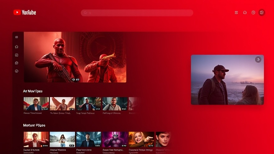
The most noticeable alteration is the brand's iconic red, transitioned to a gradient that blends into a softer magenta. This wasn't just about finding a more vibrant color; it’s a conscious effort to promote warmth and inclusivity within the YouTube community. Designers aimed to craft a tone that not only catches the eye but also enhances user engagement without overwhelming the viewer.
The Gradient: A Dynamic Symbol of Progress
The shift from red to a magenta gradient carries significant symbolism. For YouTube, this gradient is about showcasing motion and growth—qualities that lie at the heart of what the platform represents. As a site built on creativity and an evolving user base, this new visual identity aligns seamlessly with its mission to support creators at every step of their journey.
Enhanced Accessibility: A User-Centric Design
Accessibility has always been a crucial aspect of YouTube’s design philosophy. The introduction of the gradient ensures that color rendering is optimized across diverse devices—from high-definition smartphones to older screens—making the platform more welcoming for everyone. Key interface elements, including the Like and Subscribe buttons, are now more appealing and user-friendly, encouraging interaction without compromising simplicity.
Keeping the Essence: Refinement, Not Overhaul
YouTube’s redesign strategy—a blend of innovation and familiarity—avoids jarring changes to the user experience. While the layout remains grounded in its recognizable format, the refined color palette acts as a polish, enhancing the overall aesthetic without alienating the audience. This thoughtful approach emphasizes the gradual evolution of YouTube, reminding its users that change can be both bold and subtle.
Why This Matters for Brands and Franchises
For franchisors focused on maintaining brand consistency across various platforms, YouTube's strategy serves as an insightful case study. The balance between innovation and familiarity is essential for any brand looking to evolve while retaining its core identity. The impact of such nuanced changes can drive user engagement, reaffirm brand loyalty, and improve the overall user experience—critical elements that franchises must consider in their operational strategies.
In summary, YouTube’s new gradient is not just a celebratory splash of color; it's a strategic move aimed at enhancing user experience and engagement through thoughtful design. For franchisors looking to innovate while maintaining brand consistency, the lessons learned from this redesign can significantly shape their approach moving forward.
Action Steps: Embrace the principles evident in YouTube's redesign—opt for subtle enhancements that reflect your brand's evolution while staying true to its identity. Consistency and accessibility should remain at the forefront of your operational strategy.


Write A Comment